How wide is the gap between the best and worst performing Formula 1 live streaming providers? Is there a service that is consistently delivering higher race video quality? Would the differences be so visible that viewers go hunting for a better service causing churn?
Those were the questions we wanted to answer when we monitored the viewer experience of three streaming services of the Hungarian Grand Prix. We also compared the results to the French Grand Prix analysis from the previous weekend.
These questions are important because in today’s competitive streaming world, fans can easily compare the same live sports content delivered by different platforms, many of whom offer free trial options and may choose the ones with the best quality. The latest data confirms this behavior with OTT churn at an all-time high of 44% in 2021 and subscription-hopping rising to 33% of U.S. consumers saying they had both added and canceled a subscription over the past 6 months.


Our virtual probes, that watch and evaluate content just like humans do*, measured a 16-point gap between the best and worst performing service with F1 TV way ahead of the field with a SSIMPLUS VIewer Score (SVS) of 79.5 – below its 80.2 SVS result in the French. Provider 1 delivered 64 SVS - 16 SVS points behind the F1 TV leader. Provider 2 delivered 68.9 SVS. We subscribe to F1 TV Pro account, which is their only option to stream F1 races live.
The results from Provider 1 and 2 were the lowest viewer experience results recorded from all the monitored live sports in the past one month, below any of the MLB games. Half of the race the quality was so bad that it was basically unwatchable - when you have 64 SVS for the whole race it means that many parts of the 2-hour stream were with quality in the low 40s as you can see from the images below. Will F1 fans suffer through such a poor viewer experience? Will you watch it yourself? Will you not look for another option for the next Grand Prix especially when you have several options available within a few clicks?
Download the captured frames in high resolution (zip file).
 Provider 1’s Viewer Experience was in the low 40s for the second half of the race due to interlacing. Would you torture yourself with such poor viewer experience - 38 SVS?
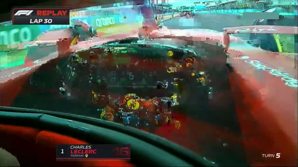
 If you are seeing double, you are not the only one. Provider 1’s feed throughout the second half of the race had this frustrating interlacing effect. It was so bad that you could hardly see which car was ahead when two cars were racing next to each other.
 This onboard cam feed was one of the worst - a 28 SVS from Provider 1. Most likely this is the double effect of interlacing and macroblocking, but we cannot really tell since the video quality was dismal.

 Another example of the interlacing/combing effect that Provider 1 had. This image has a 58 SVS. We doubt the ROLEX marketing execs would be happy to see their logo so badly distorted since their sponsorship is an estimated $40 million per year.
 How many cars do you see? This image is the result of interlacing issues most likely caused by Provider 2’s transcoder - 45 SVS.
The second finding from these two weekend’s races is that even though F1 boasts one of the most technically sophisticated production setup, with more than 120 cameras around the race track, the quality of the onboard and helmet cams are still not up to the task. The quality from these cameras ranged from the low 40s to the low 60s SVS. The goal of these cams is to help viewers experience the adrenaline rush, to feel as if they are in the cockpit. However, with the controls barely visible, everything on the track ahead and the sides is heavily blurred, the viewer experience was dismal. F1 should do more experiments and benchmarking with cameras that could provide higher quality to provide the intended experience and engagement.
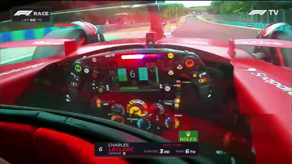 F1 TV helmet cam with a 54 SVS - no matter the provider, onboard and helmet cameras delivered mediocre and frustrating quality throughout the race.
We will continue to measure live sports viewer experiences throughout August so stay tuned for more updates by subscribing to our blog. If you would like a benchmarking report for your service please contact us at hello@ssimwave.com.

If you are going to IBC in Amsterdam, Sep 9-12, make sure to come to booth 1.B10 in Hall 1 or book a meeting with us to see our benchmarking capabilities for both LIVE and VOD video.
What and how we are monitoring
- How we perform the test:
The goal of the report is to assess content processing and encoding performance across a sports workflow. The performance of content delivery and playback is "excluded" by ensuring ideal conditions for delivery and playback while scoring the content. When the content was streamed, we made sure that we were fetching top profiles at all times - which means that the performance of ISP(s), content delivery, and players did not negatively affect viewer experience. As the video encoding and processing performance has huge room for improvement, assessing content delivery and playback performance is part of future work. ABR profile was fixed to the top profile only and the results (including visual examples) are provided just for the top profile. The content is captured and scored in raw form using HDMI capture cards installed on a computer.
-
SSIMPLUS Scale: what's a good score?
The SSIMPLUS Viewer Score is a linear scale from 0-100 where 0 means bad (a worse quality cannot be imagined) and 100 excellent (without any visible impairments). SVS is highly correlated to how an actual human being - an average viewer watching on their device - will evaluate the video quality. An overall score of 74.5 (the average we measured for one of the MLB weekends) across the streaming platforms monitored is "good enough", even if not pleasing to the eye and mildly annoying, which is why they continue to serve millions of viewers. The viewing experience (and objective scores) are significantly worse than premium SVOD platforms (generally above an SVS of 80). Also, there is significant variation in quality across various streaming options. In addition to that, there is significant variation in the quality of each streaming platform across a game as evident from the visual examples.
The SSIMPLUS Viewer Score (SVS) is the most accurate measurement of how an actual human being watching video content on their device would rate the quality of the video. It is based on more than 20 years of research into the human visual system by some of the most renowned experts in the field, including the inventor of the original SSIM, Professor Zhou Wang, who is also our co-founder with more than 80,000 citations in the field. Our team has won numerous awards for this work including two Emmys. Currently, our products SSIMPLUS LIVE Monitor and SSIMPLUS VOD Monitor are deployed by 5 of the top streaming services in the world. You can read more here.
-
Impairment identification and localization (where in the delivery chain are the impairments originating)
We can localize any video quality issue if we are at the appropriate points. The current monitoring setup for benchmarking streaming services "watches" content with software probes like viewers do at the last point of a delivery chain. The score does not localize drops in video quality (if the drops are due to bad sources or poor compression, to do that we need to monitor at upstream points in the workflow) but it does identify what viewers are perceiving, which is a great first step towards improving viewer experience. Based on our vast experience in content delivery chains and perceptual quality assessment, we can predict where an issue may be originating from after a deeper analysis of impairments.
- Technical specs (resolutions, codec, bitrate)
The services we compared are monitored at the highest resolution they are capable of delivering and forcing that resolution in respective apps while ensuring that the setup supports very high bitrates. Sports streaming services generally deliver at 1280x720, 1920x1080, and 3840x2160 resolutions at 59.94 or 60 frames per second. The most common codec used is H.264/AVC. The most common ABR standard is MPEG-DASH. Typically bitrates are between 5 and 8 Mbps using variable bitrate approaches.
- Other measurement considerations
SSIMPLUS scores are device adaptive. The data presented in the blog posts correspond to viewer experience on a 65" 4K TV. Higher resolutions do benefit from higher content detail, if available. 4K resolution has a much higher likelihood to get to a 100 SVS and it would get to a 100 when there are no perceptually visible impairments in the content.
The scores provided in this blog are overall scores across the event. We have in-depth per-second and per-frame scores that show quality variation across content.
- How does the score compare from game to game or content to content?
The score considers saliency by modeling visual attention when assessing perceptual quality. Generally speaking, impairments in areas that matter more to viewers drag the score down further than impairments in areas that do not matter as much. As a result of this unique ability of the score, baseball scores are comparable to F1 scores and to any other sport we monitor.
- How we take the screen captures and what their measurements actually show
Content is scored in raw format real-time using HDMI capture cards. Content shared in this blog are frames extracted from the captures triggered based on quality thresholds. The scores for the frames presented in this blog post are “video scores” measuring overall viewer experience when a specific frame is played on a 4K 65” TV screen and not the score just for the exact frame, which can also be provided.